A visitor lands on your website, sees a wall of text, and closes the tab. The product might be excellent. The offer might even be fair. But the page made understanding it feel like homework. Readability is a design decision, a writing decision, and often a business decision all at once.
- Answer the visitor’s question before adding detail.
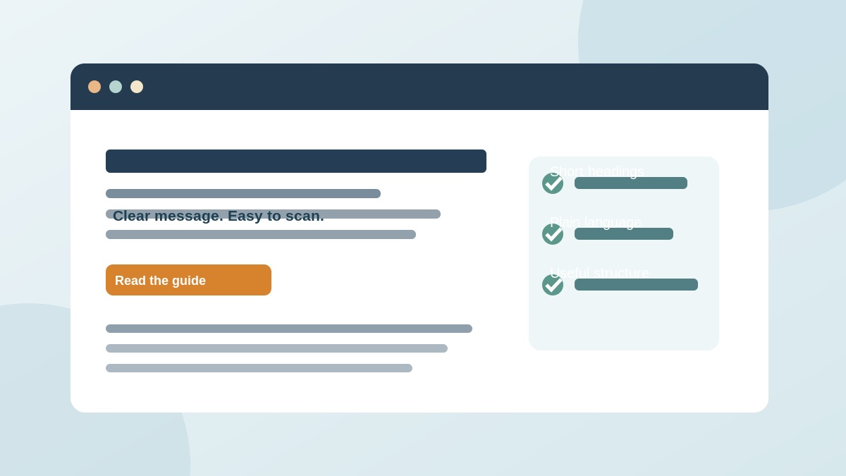
- Use meaningful headings and scannable formatting.
- Test comprehension on real devices with real people.
The problem is not that visitors are impatient
Picture a local repair company’s homepage. The first paragraph says it “leverages an integrated, forward-facing service ecosystem to enable optimized outcomes.” You read it twice and still do not know whether the company repairs refrigerators. The problem is not the reader’s attention span; the company has hidden the useful answer under corporate language.
Replace it with “Fast refrigerator repairs, clear arrival windows, and a written quote before work begins.” Now the visitor knows what the business does and can decide whether to continue. Good web copy respects a person’s limited time without assuming they are unintelligent.
Readability includes vocabulary, sentence length, line width, headings, contrast and the order of information. Each one either helps or slows understanding. It is not a request to remove nuance. Complex services still need accurate explanations; they simply need to be organized so readers can follow the logic.
Research-backed ways people read online
The Nielsen Norman Group’s readability research collection covers practical methods for making online content scannable. Its guidance on long-form content highlights summaries, headings, callouts and visual structure as ways to improve comprehension and engagement. People often scan first to decide whether the page contains the answer they need.
Accessibility guidance reaches a similar conclusion. The W3C WAI Style Guide recommends simple language where appropriate, short sentences and breaking up dense blocks of text with headings, graphics or lists. Such choices help many readers, including people reading in a second language.
None of this means a long article is automatically bad. The problem is making every sentence fight for attention. A good long article is structured like a useful conversation: answer the immediate question, explain why it matters, then offer the details that help the reader act.
If the reader has to decode your message, they may never reach your offer.
Give the first screen a job
The opening of a business page should answer three questions quickly: what is offered, whom it helps and what the reader can do next. If those answers are buried below generic claims, the page is working harder than it needs to.
1. Lead with the outcome, not the slogan
“Book a reliable office cleaning team” is more immediately useful than “Elevating excellence through transformation.”
2. Explain one concrete difference
Describe a feature customers can verify, such as flexible times, trained technicians or an itemized quote. Avoid unsupported superlatives.
3. Make the next action obvious
Use a direct button such as “Request an estimate” rather than “Unlock our journey.” Our clear call-to-action guide offers more examples.
4. Put key qualifications near the claim
If delivery is restricted by geography, timing or eligibility, say so before the visitor reaches checkout.
Read the first screen aloud without looking at the rest of the site. Would an unfamiliar person know what the company sells? If not, rewrite before tweaking fonts or animation.
Before and after: an everyday service page
Here is an illustrative rewrite, not a real client test. Before: “Our bespoke technological solutions empower end-to-end operational excellence with personalized ecosystem innovation.” After: “We connect your booking form, customer list and calendar so appointments stop falling through the cracks.” The second version is more specific. It says what the tool does and what problem it addresses.
Another example: Before: “Contact us to experience superior service.” After: “Tell us what needs fixing. We’ll reply with available appointment times and an estimate.” The stronger version explains the process and reduces uncertainty. It does not pretend all visitors want to commit immediately.
Choose simple words when they are accurate. “Use” often works better than “utilize.” “Help” can be better than “facilitate.” “Cost” is usually clearer than “financial outlay.” Technical terms are fine when the audience needs them; define unfamiliar ones once and move on.
Before publishing, check that rewritten copy still makes accurate claims. Clarity cannot come at the expense of promising a speed, price or result the business cannot deliver.
A page-level readability audit
Instead of rewriting everything, start with one important page—the service page that gets traffic but few enquiries, the landing page people abandon, or the article that brings visitors to the site. Then work through a concrete checklist.
1. Give each section one main idea
A heading should prepare the reader for what comes next. If the paragraph covers three unrelated topics, split it.
2. Shorten sentences without flattening meaning
Break long explanations at natural pauses. Keep enough context so the argument remains trustworthy.
3. Use lists for real sequences
Steps and comparisons belong in cards or lists. A five-step process buried in one paragraph is hard to follow.
4. Check text on a phone
Look for tiny type, overly long lines, crowded buttons and horizontal scrolling. Test at different sizes, not just your laptop.
5. Make links meaningful
“Read our mobile usability checklist” tells readers more than “click here.”
If you have hundreds of pages, prioritize by potential impact and revisit templates that repeat the same issue. You do not need to edit every word sitewide before seeing whether the approach helps.
What real behavior can teach you
When changes are live, observe how visitors use the page. Microsoft Clarity describes heatmaps and session recordings that can reveal where visitors click, scroll, hesitate or abandon a flow. Those observations can suggest problems but do not tell you what people were thinking. Pair them with task-based testing and honest user questions.
Ask a new reader to complete a task: find the price range, understand the main service, or locate the return conditions. Watch where they hesitate without coaching them. A single session can reveal an obvious confusing heading, but it is not a statistically reliable estimate of all visitors.
Where possible, test a clear rewrite against the original with similar audiences and enough data for a responsible comparison. Read our A/B testing guide for an introduction. Monitor meaningful actions rather than declaring victory solely because people scroll farther.
Designing a page for skimming and deep reading
Good online content works at two speeds. A first-time visitor wants to skim: headlines, supporting labels, relevant images and one visible next step. A motivated reader wants depth: details, evidence, caveats and examples. You do not need to choose one audience at the expense of the other. Put a concise answer near the top, then build a clean path into the explanation.
For a product page, that could mean a short sentence about the main use, a clear image, three factual features and an accessible purchase or enquiry button. Farther down, include dimensions, materials, compatibility, delivery information and common questions. For an article, begin with the answer and context, then use subheadings to organize the supporting argument. In both cases, hiding essential details behind overly clever labels creates unnecessary effort.
Visual hierarchy matters too. A headline in huge bold type cannot rescue weak words. Similarly, a perfect sentence becomes hard to use if the contrast is low or the text is crushed into a narrow column. Preserve readable line spacing, meaningful heading levels, visible focus states and link labels that make sense when read out of context. Test with a keyboard and a phone, not only a mouse on a large desktop monitor.
When revising, keep a short change log: original wording, revised wording, reason for the edit and the metric or user task you hope to improve. This simple habit makes later analysis more honest. If the numbers do not improve, you will still have a clear record of what you changed and why.
Protect the meaning while you simplify the words
A page can become easier to skim yet less accurate if an editor removes every qualification. Consider “All orders arrive tomorrow” versus “Next-day delivery is available in selected areas for orders placed before 2 p.m.” The second is longer but more useful because it sets a truthful expectation. Readability is not a contest to use the fewest characters; it is the discipline of reducing unnecessary effort while preserving important facts.
When your product includes technical specifications, use simple labels followed by details. Instead of hiding constraints in legal-looking blocks, place the relevant information near the decision point. For example, list the devices a software tool supports next to the download button and include an accessible link to full system requirements. Explain uncommon terminology the first time it appears.
Visual tests are useful, but so are plain questions. Ask three people unfamiliar with your business to explain the offer in one sentence. If their answers vary widely, revisit the page. If they cannot tell what happens after clicking the button, fix that too. Good copy gives the visitor an accurate mental model of what will happen next. When an interface behaves as promised, the writing has done part of its job.
A one-hour editing sprint you can repeat
Take your most important page and divide an hour into four focused pieces. Do not turn the task into a complete redesign.
1. Minutes 0–15: find the visitor’s question
Write the one question the page must answer and highlight sentences that fail to help with it.
2. Minutes 15–30: rewrite the opening
Replace vague claims with the service, audience, concrete benefit and next action.
3. Minutes 30–45: add signposts
Use accurate headings and accessible lists for steps, requirements and choices.
4. Minutes 45–60: test on a phone
Read aloud, inspect links, check the layout and ask one unfamiliar person what the page means.
For longer content, our article Hard to Read, Hard to Share explores why formatting affects whether ideas are understood and passed along. Good writing and good interface design solve the same human problem: making a next step easier to see.
Frequently Asked Questions
Does shorter copy always convert better?
No. The right length depends on complexity and user needs. Clear structure and relevant information matter more than a blanket word limit.
Should I use readability-score tools?
They can flag complexity, but human testing and accurate wording are more important than chasing one numeric score.
Do headings help accessibility?
Yes. Meaningful heading structure supports navigation and comprehension, including for assistive technology users.
Which page should I improve first?
Choose a high-value page with meaningful traffic and a confusing journey; measure a useful action before and after the edit.