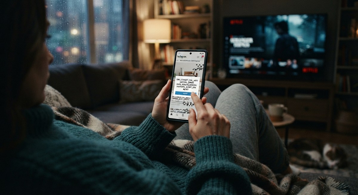
You've done this yourself. A friend sends you a link. You tap it, and you're hit with a cookie banner, a pop-up asking for your email, and a wall of tiny gray text.
You close the tab. Not because the content was bad, but because reading it felt like work.
No one left a comment. No one wrote a complaint. That piece of content simply died quietly, and its author will never know why.
Most content isn't rejected. It's abandoned. And it's usually abandoned for one of two reasons: it was hard to read, or it was hard to share. Both are fixable, and neither needs a bigger budget. Here's how.
- Most people skim web pages. Short paragraphs, clear headings and plain words help them stay.
- Wordle's one-tap emoji share grid is a lesson in small, spoiler-free sharing that looks good anywhere.
- Much sharing happens in private chats and email, where your link preview acts as your billboard.
- Test your page on a phone, set a clean preview, and let people share without logging in.
Content Doesn't Get Rejected. It Gets Abandoned.
Here's a humbling fact. A well-known Nielsen Norman Group analysis of how people use web pages found that on an average page, visitors have time to read at most about 28% of the words, and more realistically around 20%. It's an older study, but later eye-tracking research keeps pointing the same way: people scan.
That doesn't mean your writing doesn't matter. It means your reader decides in seconds whether to settle in or leave, and you can make staying easy.
There's another reason to keep things simple. Many of your readers aren't reading in their first language. Plain words and short sentences travel much farther than clever ones.
Make It Easy on the Eyes
Readability is mostly small, boring details. But small details decide whether someone reads one paragraph or the whole page.
| Hard to read | Easy to read |
|---|---|
| Long blocks of text | Paragraphs of two to four lines |
| Small, pale gray text | Dark text, at least 16 pixels on phones, with strong contrast |
| Pages with no breaks | A heading every few paragraphs and bold for key phrases |
| Lines that stretch across the whole screen | A narrower column, roughly 50 to 75 characters per line |
| A pop-up before the first sentence | Content first, offers later |
| A clever, vague headline | A headline that says what the reader will get |
On contrast, the international accessibility guidelines (WCAG) recommend a contrast ratio of at least 4.5 to 1 for normal text. Free contrast checkers will tell you in seconds whether your colors pass.
Then look at the words themselves. The best edit you can make is replacing fancy phrases with simple ones:
After: "Reply to customers fast. Happy customers come back."
Make Sharing a One-Tap Moment
In October 2021, a software engineer named Josh Wardle released a small word game called Wordle. You get one puzzle a day, six tries to guess a five-letter word, and that's it.
In December, a share button arrived. After you finished, one tap copied a small grid of colored squares showing how you did, without revealing the answer. It was already how some players had started sharing their results, and Wardle turned it into a feature.
The numbers are striking. The New York Times reported that Wordle had 90 players on November 1, 2021 and over 300,000 by early January. Later that month the Times bought it for a price in the "low seven figures." Wordle's growth had many causes, but the share grid is widely credited as a big one.
Why did it work? Look at what the share did right:
- It took one tap. No sign-up, no extra steps.
- It was tiny. A few lines of squares fit anywhere.
- It didn't spoil anything. You could share without ruining the fun for others.
- It told a story. Strangers could read your grid at a glance, and wanted to try it themselves.
The easier you make it to share, the more your content travels without you.
The Share Nobody Has to Do
Sometimes the smartest move is making sharing happen automatically. In 1996, the free email service Hotmail added one line to the bottom of every email sent from its accounts: "PS: I love you. Get your free email at Hotmail," with a link to sign up.
Senders didn't have to do anything. The invitation rode along inside something they were already doing. According to the account in the book Viral Loop, Hotmail reached about one million users in roughly six months. Microsoft bought it less than two years after launch, for a reported $400 million.
You can't add a signature to someone's email today, but the idea still works: make your content carry its own invitation. A clear title, a friendly closing line and a clean link do much of the same job.
Where Sharing Really Happens: Private Chats
Think about the last link you shared. Did you post it publicly, or send it to a friend in a chat?
In 2012, journalist Alexis Madrigal wrote in The Atlantic about "dark social," meaning links people pass along through email and messaging apps, where analytics tools often can't see them. Studies since then have found that a large share of sharing happens this way, and the exact numbers vary from study to study.
For you, the takeaway is practical. When someone pastes your link into a WhatsApp chat, the preview card is what your content looks like. It's your billboard. Apps such as WhatsApp, Slack and LinkedIn build that card from small hidden tags on your page called Open Graph tags.
Description: one friendly sentence about what readers will get.
Image: about 1200 × 630 pixels. Keep the file small, ideally under 300 KB, because WhatsApp is reported to skip larger images.
Test it yourself. Send your link to a friend, or to yourself, in a chat app. If the card looks plain or broken, fix the tags before you share it widely.
The Blueprint: Make Your Next Post Easy to Read and Share
Step 1: Read It on Your Phone
Open your page on a phone, outside if you can, and read only the first screen. Is the text clear? Can you tell what the page is about? Is anything blocking it?
Step 2: Cut the Warm-Up
Delete your first paragraph and see if the piece still works. Often the real beginning is the second paragraph. Start with the point.
Step 3: Add the Shares People Actually Use
Offer a "Copy link" button, plus email and WhatsApp, and perhaps one or two social networks your readers use. Don't ask anyone to log in or subscribe just to share.
Step 4: Set Your Preview
Write a clear title, a one-sentence description and a clean image, then check how the link looks in a chat.
Step 5: Watch One Real Person Try
Ask a friend to read your page and send it to someone. Don't help. Notice where they hesitate, squint or give up. Fix that first.
Five Things That Quietly Kill Sharing
Mistake 1: Asking people to sign up first
A login wall before reading or sharing turns interested people away. Let them in first, ask later.
Mistake 2: Twelve share buttons nobody uses
A crowded row of icons creates choice paralysis. Pick three or four that your readers really use.
Mistake 3: Tiny buttons for big thumbs
Tap targets that are too small cause mistaps. Aim for roughly 48 pixels so they're comfortable on a phone.
Mistake 4: Putting key words inside images
Text locked in a picture often can't be searched, translated or read aloud by screen readers. Keep important words as real text.
Mistake 5: Sharing messy links
Long links stuffed with tracking codes look suspicious in a chat. Share the clean address whenever you can.
Conclusion: Make It Easy to Finish and Easy to Forward
Great content isn't only about great ideas. It's about whether a tired person on a phone, in a hurry, can read it and pass it on without effort.
This week, open your best article on your phone. Cut the warm-up, break up the big paragraphs, fix the preview and add a copy-link button. Small fixes like these are what keep good content from dying quietly.
Frequently Asked Questions
What does readability mean for a web page?
It means how easily someone can read and understand your page on their device. Short paragraphs, clear headings, simple words, strong contrast and a comfortable text size all improve it.
How long should paragraphs be online?
A common rule of thumb is two to four lines, and even shorter on mobile screens. Short paragraphs give readers frequent places to rest and keep scanning.
What is dark social?
It's a term coined by journalist Alexis Madrigal in 2012 for links shared through private channels like email and messaging apps. Analytics tools often can't see where that traffic came from.
Why does my link look plain or broken when I share it?
The page is probably missing Open Graph tags, or the preview image is too big or can't be reached. Add a title, description and a properly sized image, then test the link in a chat app.
Do I need share buttons on every article?
They're helpful but not essential. A simple copy-link button plus WhatsApp and email covers many readers, and it should never require a login.