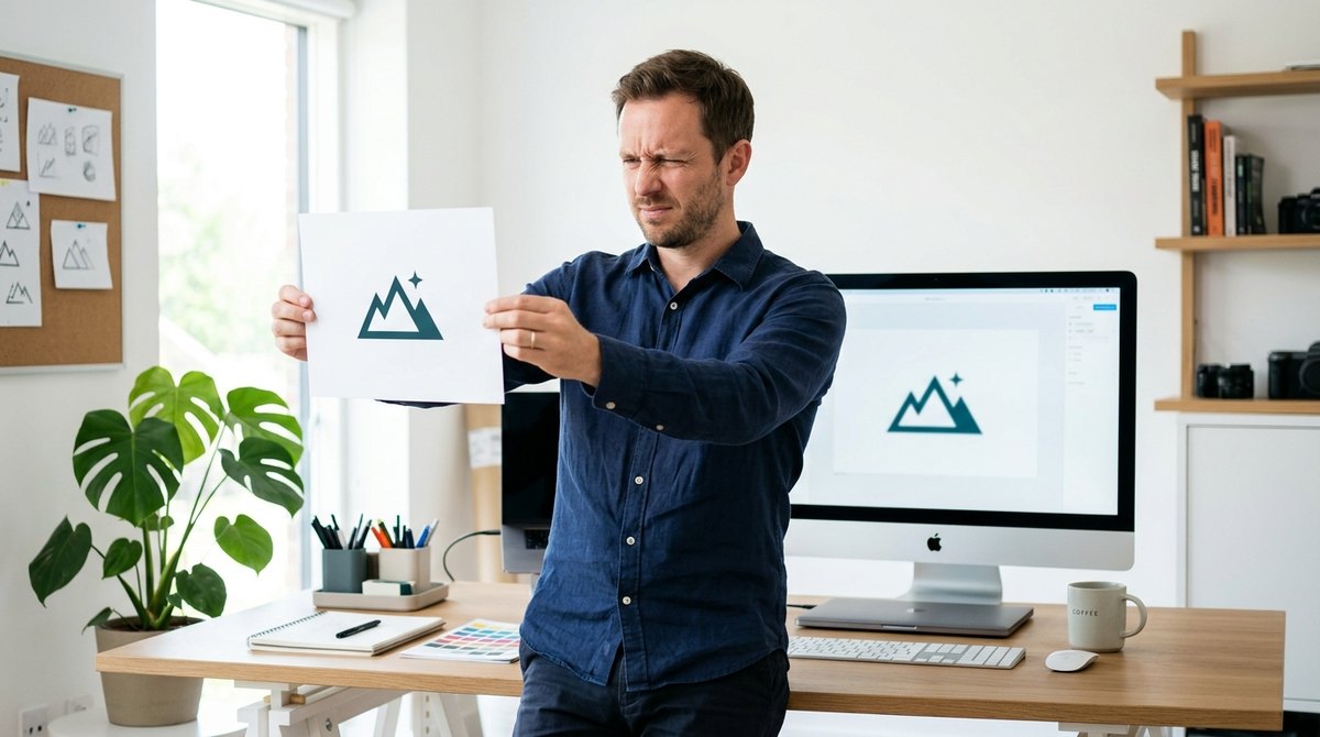
Print your logo. Hold it at arm's length. Now squint until everything goes slightly blurry.
Can you still tell what it is? Do you recognize the shape, the contrast, the overall feeling? Or does it turn into a gray smudge where the details disappear?
That's the squint test, and it takes about thirty seconds. It's one of the quickest, cheapest ways to find out whether your logo will work in the real world, where people see it small, fast and often in the wrong light.
- The squint test blurs fine detail, so you see only the overall shape and contrast, the way a quick glance does.
- Logos appear in tiny sizes, on phones and in a split second, so simple and bold beats detailed and clever.
- Carolyn Davidson designed the Nike swoosh in 1971 for $35, a simple shape that works at any size.
- In 2015, Google replaced its logo with a simpler, bolder design that reads better on small screens.
- Combine the squint test with a tiny-size check, a grayscale check and a one-color check.
How the Squint Test Works
When you look at a logo on a big monitor in your design software, every line is crisp. But that's not how your customers meet it. They see it as a tiny icon in a browser tab, a small profile picture on social media, a stamp on a package or a sign across the street.
Squinting blurs the fine details and leaves only the big picture: the main shape, the balance of light and dark, and the strongest areas of contrast. If the logo still reads clearly in that state, it will survive most real-life situations. If it falls apart, the problem isn't your eyes. It's the design.
Designers use blur and squint checks for the same reason: they show what the brain notices first. We cover the same principle for whole pages in our guide to visual hierarchy.
Why It Matters
A logo's job isn't to explain your whole business. Its job is to be recognized quickly and remembered easily. Every time a customer spots it and thinks "I know that," the brand gets a little stronger.
Complicated logos make that harder. Thin lines vanish when shrunk. Tiny details turn to mud. Too many colors fight each other. And a logo that can't be recognized at a glance does little work for you every day, on every screen. It's part of the bigger picture we describe in why visual quality is a trust signal.
A great logo doesn't need to be studied. It needs to be spotted.
The $35 Swoosh
One of the most recognized logos in the world began as a student project. In 1971, Carolyn Davidson, a graphic design student at Portland State University, was hired as a freelancer by Phil Knight, the co-founder of what would become Nike. She was paid $35 for the design, according to Business Insider.
Knight wasn't thrilled at first. He reportedly said, "I don't love it, but maybe it will grow on me." It did. A single curved shape, with no text and no fine detail, became recognizable on shoes, shirts and billboards, from huge to tiny. Years later, in 1983, Davidson was given a gold ring with a swoosh and Nike stock as a thank-you.
The lesson isn't that logos should be cheap. It's that the shape worked because it was simple. It passes the squint test with ease. And you don't need a famous company to benefit from the same principle.
Why Google Simplified Its Logo
In September 2015, Google replaced its familiar serif wordmark with a cleaner, thicker sans-serif design. The company explained that people now meet its brand on many screens, from desktops to phones to watches. The new letters were easier to read at small sizes, and Google also introduced a compact colorful "G" for places where the full name wouldn't fit, as reported by CNN.
It's a good reminder that a logo isn't only for the front of a building. It has to work in the smallest square on a phone. Many brands now keep a simple icon or monogram alongside the full logo for exactly this reason.
Five Quick Logo Checks
The squint test is a great start. Add these four checks and you'll catch almost every common problem:
1. The squint test
Hold it at arm's length or step back from your screen, and squint. Is the main shape still clear? Do the strongest parts of the logo still stand out?
2. The tiny-size test
Shrink the logo to about the size of a browser tab icon, roughly 16 to 32 pixels wide. Can you still tell what it is? If you only have a long wordmark, create a simple icon version for small spaces.
3. The grayscale test
Turn the logo to black and white. If it relies on color to be understood, it may disappear on printed forms, stamps or when color isn't available.
4. The background test
Place it on a white, a black and a busy photo background. A good logo has versions that stay readable on all of them.
5. The memory test
Show it to a friend for five seconds, hide it, and ask them to sketch it. If they can capture the basic idea, you have a memorable design.
What Usually Fails the Test
Thin, delicate lines
Hairline strokes disappear when shrunk or printed on rough surfaces. Choose bolder lines.
Too much detail
Small illustrations, textures and tiny text turn into noise. Keep the main idea to one simple shape or mark.
Gradients and effects
Shadows, glows and many-colored gradients often look muddy in print or at small sizes. A flat version should always exist.
Low contrast
Light gray on white, or two similar colors side by side, blur together. Strong contrast keeps your logo readable.
Crowded space
A logo with no breathing room feels cramped and hard to spot. See our guide on giving your logo room to breathe.
If your logo fails, don't panic. Often the fix is simplifying: removing one element, thickening a line or creating a simple icon version. And once your logo works, check that your website and social profiles use it consistently, as we explain in our brand audit guide.
Conclusion: Simple Is Memorable
Great logos aren't necessarily clever. They're clear. They survive being small, blurry, black and white and glanced at for a second. And that's exactly how most people will meet yours.
Right now, open your logo, take a step back and squint. Then shrink it to the size of a tab icon and turn it gray. If it still works, you're in good shape. If it doesn't, you've just saved yourself from years of an invisible logo.
Frequently Asked Questions
What is the squint test for logos?
Squint at your logo, or view it blurred, to see only its overall shape and contrast. If it's still recognizable, the design is simple and strong enough to work at small sizes and quick glances.
What size should a logo work at?
It should stay recognizable even at very small sizes, like a browser tab icon of roughly 16 to 32 pixels wide, as well as on big signs and packaging.
Why did Google change its logo in 2015?
Google said it wanted a design that works across many devices and screen sizes. The new bolder letters read better small, and it added a compact G for tight spaces.
Should my logo work in black and white?
Yes. A good logo should be understood without color, because it will be printed, stamped and displayed in many places where color isn't available.
How do I fix a logo that fails the squint test?
Simplify it: remove small details, thicken thin lines, increase contrast and create a simple icon version for small spaces.