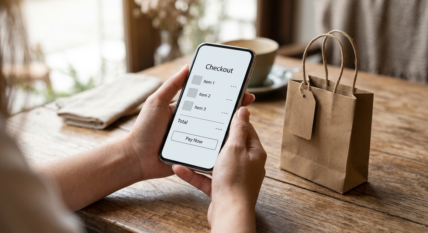
The customer is ready. They like the product, believe the price is fair, and have probably already imagined using it. Then the business asks them to open another page, create an account, hunt for delivery information, and fill in details they have already supplied. Somewhere between interest and payment, the moment disappears.
This is not always a problem with the offer. Often it is a problem with the work required to say yes. Making it easy to buy is one of the least glamorous and most valuable things a small business can do. It is also much bigger than removing a click from checkout: it means making every step from first impression to completed order clear and predictable.
The sale starts before the cart
A shopper does not arrive on your site with the same certainty as its owner. They need to know what you sell, who it is for, how much it costs, what happens after payment, and what to do if something goes wrong. If that information is scattered across five pages, you have created a research assignment instead of a shopping experience.
Imagine an independent candle shop. A visitor lands on a product page from a social post. The fragrance is described beautifully, but the size is unclear, shipping costs appear only at checkout, and there is no photo showing the candle in a real room. The visitor opens another tab to compare. They may return, but the shop has handed its momentum to a competitor.
This illustration is hypothetical, not a measured conversion study. The principle is grounded in research: Baymard Institute has repeatedly observed friction in cart and checkout flows causing shoppers to abandon purchases. The practical lesson is to remove uncertainty before you remove buttons.
The smoothest sale feels less like being pushed and more like finally having the answer you needed.
Stop treating every click as equally bad
“Every extra click kills conversions” is a useful warning, but it is not literally true. A helpful step can increase confidence. A delivery selector that shows accurate timing may be worth keeping. An optional review step that prevents a costly mistake may also help. An unnecessary newsletter popup between the cart and payment probably does not.
Baymard's checkout form-field research makes an important distinction: the number of steps alone is not the whole problem. The total effort and number of fields shoppers must understand often matter more. A short-looking form that asks confusing questions can feel harder than a clearly organized sequence.
That changes the way you audit your store. Do not celebrate because the funnel now has three pages instead of four. Ask whether customers finish faster, make fewer mistakes, understand charges, and know what they will receive. The goal is not minimalism for its own sake. It is an easier decision.
Five moments where confidence often leaks
1. The offer is hard to recognize
Lead with what the product does and who it helps. A beautiful slogan cannot substitute for the actual offer.
2. Price details arrive too late
Make relevant delivery costs, taxes, quantities, and recurring terms clear before the buyer is emotionally committed.
3. The next action is ambiguous
Use a straightforward primary button: Buy now, Choose a size, or Book a consultation. Avoid a screen full of competing calls to action.
4. Sign-up becomes a gate
Offer a guest checkout when appropriate instead of making a first-time customer create an account before paying.
5. The confirmation feels uncertain
After purchase, explain what happens next, how to get support, and where to find tracking or receipts.
The guest-checkout issue is especially tangible. In Baymard's research on guest checkout, users sometimes thought registration was mandatory simply because the guest option was difficult to spot. Making an option available is not the same as making it discoverable.
A real research example: guest checkout at Stance
Baymard's 2026 checkout UX report shows examples from retailers including Stance and Williams Sonoma. In the documented examples, users who chose guest checkout were reassured they could create an account after the purchase. That sequence respects the buyer's main goal: complete an order without being interrupted by a secondary decision.
You do not need the scale of a national retailer to apply that idea. A small store can make guest checkout prominent, explain order-tracking options, and invite account creation on the confirmation page. It can then measure whether more people complete checkout rather than assuming an account wall increases loyalty.
This is a design pattern illustrated by research, not proof that copying any one retailer's interface guarantees the same results. Context still matters: a business offering ongoing subscriptions may have legitimate account requirements that a one-time purchase does not.
How to walk through your own site as a stranger
The best first audit costs nothing. Open a private browser window on your phone. Search for one of your products using ordinary customer language, arrive on the relevant page, and try to buy. Do not use saved passwords or shortcuts your regular customers do not have.
Keep a notepad beside you. Every time you pause, write down why. Was a shipping rule missing? Was the size unclear? Did the page ask for information too soon? Did you have to return to the product page to confirm what was in the basket? A pause is a clue, even when the transaction technically succeeds.
Next, repeat on a slower connection and a different screen size. A checkout that feels smooth on a large desktop can become a finger-tapping obstacle course on a small phone. Test the actual sequence, not only a screenshot of its design. Our related article, Simplify Checkout, looks more closely at friction inside the payment flow.
The most useful purchase-page rewrite
Many businesses respond to low conversions by redesigning everything. Try something smaller first: rewrite the top of one important product or service page so a visitor can answer six questions without scrolling far.
What am I buying?
Use the actual product or service name, not just a poetic promise.
Who is this for?
Specify the customer or use case in natural language.
What will it cost?
Show the relevant price and explain material conditions rather than hiding them in small print.
What happens next?
Explain delivery, access, onboarding, or the next appointment step.
Can I trust this?
Include relevant evidence: real photos, clear policies, and authentic customer feedback where available.
What do I do now?
Make the next action visible and predictable.
This is where the visual and verbal parts of conversion work together. Better copy reduces interpretation. Better images reduce doubt. Better navigation prevents the buyer from losing the thread. You can use the free 30-Day Marketing Planner to schedule one improvement each week instead of attempting a costly all-at-once redesign.
Measure the decision, not just the button
A higher click-through rate on the Buy button does not automatically mean more revenue. Perhaps the new copy attracts curious visitors who never pay. Perhaps more people begin checkout but fewer finish because an important condition is hidden until later. Track the full journey from qualified visits to completed purchases or enquiries.
A simple dashboard might compare product-page views, add-to-cart rate, checkout starts, completed purchases, refund requests, and support questions. When a change improves one stage but worsens another, investigate before declaring victory. Our KPI guide can help keep the scoreboard focused on meaningful outcomes.
For service businesses, replace purchase events with appropriately defined actions such as qualified contact submissions or booked calls. A design consultation is not a shoe purchase; it may require a few more steps to ensure the client and provider are a fit. Friction that protects both sides is different from friction that accomplishes nothing.
Where “easy” must never become misleading
A fast checkout is not permission to hide a cost, preselect an add-on, or make the terms hard to understand. Some businesses remove one click by silently adding another product to the basket. Others disguise recurring charges in faint text to make the final button look effortless. Those tactics may produce accidental purchases, but they are a poor basis for trust.
A good journey is easy and informed. People should know when an offer renews, when a delivery fee applies, what they receive, and what they can cancel. This applies to service quotes as much as online stores. For example, a freelance designer can make it easy to book a discovery call while still being honest about availability, project scope, and next steps.
There is also a practical tension between speed and accuracy. A delivery-address confirmation may add seconds but prevent a costly mistake. A clearly labeled final order summary can help someone correct a quantity before payment. Judge these steps by whether they protect the buyer, not whether they make a flow chart look longer.
The right question is: What effort creates understanding, and what effort merely delays a decision? Keep the first kind. Remove the second. Your conversion metrics should never reward you for making a promise customers did not knowingly accept.
A small experiment for this week
Choose one page that already receives traffic, and ask three people who have never used it to complete the key action while narrating what they expect. Do not coach them. Notice hesitation, unanswered questions, and accidental detours. Fix the clearest recurring problem first.
Day 1: capture the journey
Record the current path, key questions, and the baseline conversion metric you can actually trust.
Days 2–3: remove one obstacle
Clarify a cost, reveal guest checkout, shorten an unnecessary form, or rewrite the primary button.
Days 4–7: watch real behavior
Check errors and the full completion path. Do not mistake one good day for a proven improvement.
A business wins when the customer can spend their energy deciding whether the offer is right, not figuring out how to buy it. That distinction sounds small. But when it is respected consistently, everything from the landing page to the final receipt begins working together. Make the next purchase feel obvious, honest, and easy—and let the results tell you where to improve next.
Frequently Asked Questions
Does every extra click reduce conversions?
No. Necessary steps can build clarity and prevent mistakes. The problem is unnecessary effort, confusing forms, and uncertainty.
Is guest checkout better than forcing accounts?
For many one-time retail purchases it reduces friction, but the right approach depends on the product and customer needs.
Which part of the purchase journey should I fix first?
Observe real shoppers and prioritize repeated obstacles or unclear information before a broad redesign.
What should I measure after a change?
Track completed purchases or qualified enquiries alongside intermediate actions, errors, and customer support questions.